15 Easter Tablescapes for a Fresh Festive Mood
Easter tablescapes are intentional table settings that blend springtime florals, pastel palettes, and celebratory elements to create a welcoming dining experience. This article delivers 15 Easter tablescape ideas—from classic botanical styles to modern minimalist approaches—so you can set a table that feels both seasonally fresh and genuinely festive.
Fresh Easter tablescapes whisper spring back into your home. There’s a lightness to them—the softness of pastel linens, the quiet grace of delicate place cards, the way candlelight catches on fresh-cut stems. These aren’t heavy or overdone; they’re purposeful. Easter tablescapes celebrate renewal, gathered moments, and the permission to bring nature indoors for one perfect meal. Here are 15 ideas worth saving—and stealing.
Why Easter Tablescapes Work So Well
Easter tablescapes tap into something deeply human: the urge to mark transitions and gather meaningfully around a shared table. Spring itself is the design style—after months of dormancy, gardens awaken, light angles differently through windows, and color returns. Easter tablescapes translate this seasonal shift into an intimate, edible ritual that honors both tradition and individual taste.
The materials that anchor great Easter tablescapes are accessible and natural. Think cream linen napkins, parchment-white place cards, fresh eucalyptus and ranunculus blooms, unbleached table runners, and ceramic or stoneware plates in soft whites or pale greys. Metal accents lean toward brushed gold or silver—never shiny or jarring. The palette is built on pastel foundations: soft sage green, pale butter yellow, blush pink, cream white, and touches of sage grey or lavender grey.
Easter tablescapes are trending because people are reclaiming the ritual of the seated meal. After years of hushed, fast dinners, families and friends are investing in moments that slow down time. Fresh Easter tablescapes make this intentional—they signal that this gathering matters, that the table itself is part of the story being told.
Even small dining spaces can achieve statement Easter tablescapes. The key is restraint: choose a single focal point—flowers or candles—and let negative space breathe. A narrow table works beautifully with a single runner down the center and strategic blooms rather than scattered arrangements. Minimize place cards and decor clutter. Quality over quantity is not just a principle here; it’s a necessity that often looks better anyway.
Easter Tablescapes at a Glance
| Element | Trait 1 | Trait 2 |
|---|---|---|
| Philosophy | Intentional gatherings | Seasonal storytelling |
| Key Materials | Linen, fresh botanicals, ceramics | Eucalyptus, ranunculus, unbleached paper |
| Color Palette | Pastels + natural neutrals | Soft sage, blush, cream, lavender grey |
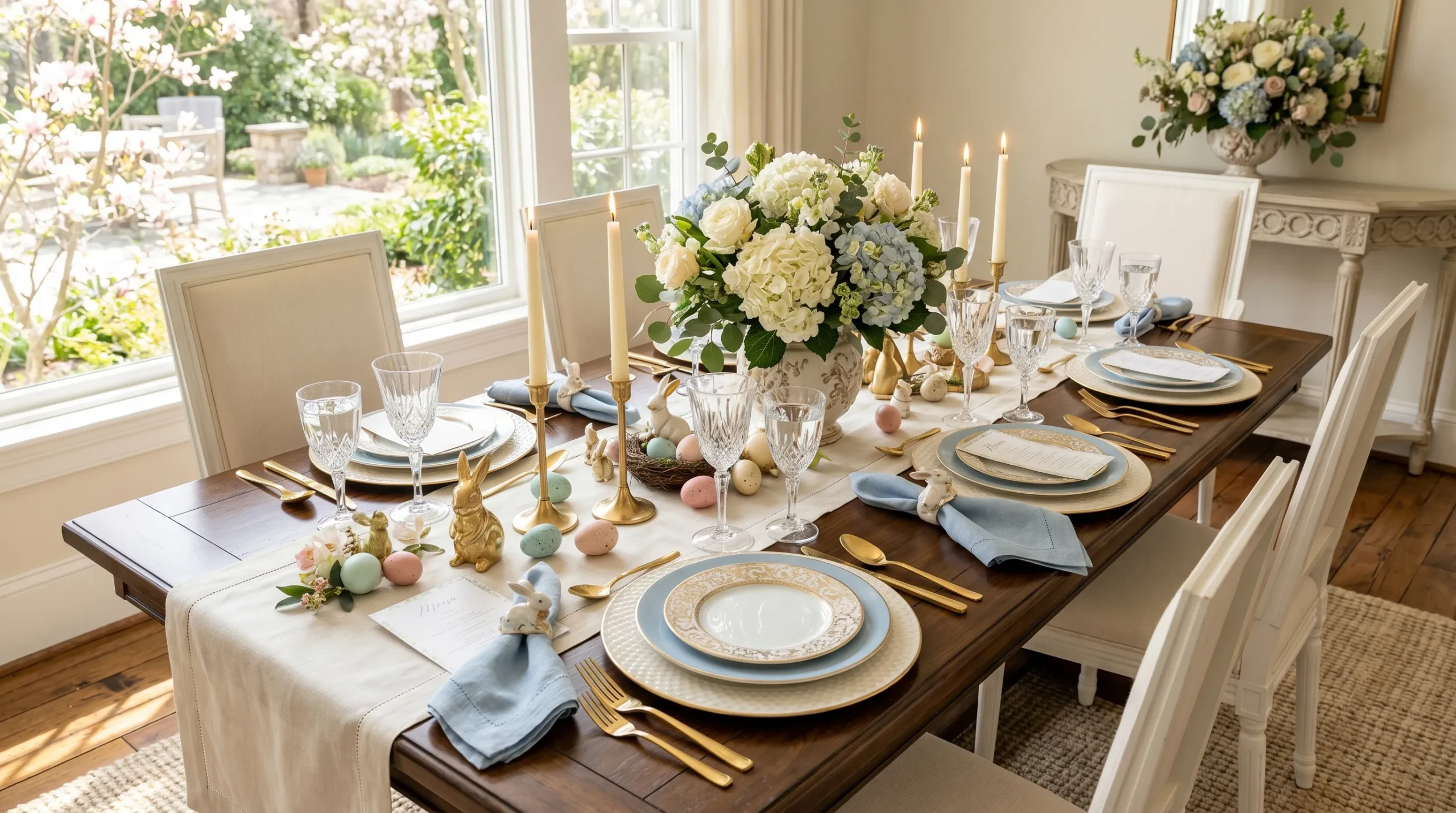
1. Soft Sage Linen with Blush Peonies
Vibe: Serene, romantic, calming.
Why It Works: This Easter tablescape relies on a monochromatic softness—the sage linen anchors everything without competing visually with the flowers. Peonies introduce texture through layered petals while remaining in the pastel family, and the cream ceramics and pale wood echo the table’s natural base. The narrow eucalyptus garland creates a horizontal flow without visual weight, and pale candles add warmth to an otherwise cool-toned palette. This approach uses negative space strategically—nothing fights for attention. The design principle at work is restraint: by narrowing the color range to three soft tones, the eye rests and the flowers become the undisputed focal point.
How to Get It: Start by sourcing a sage green linen (or cotton-linen blend) table runner or full tablecloth—brands like West Elm or Etsy sellers specializing in natural linens have excellent options in this exact tone. Pair it with cream or white ceramic plates (a simple dinner plate and charger work beautifully). The flowers are the hero: three to four stems of blush peonies in a single low-neck ceramic pitcher create impact without visual clutter. Tie each sage napkin with a narrow peach or blush ribbon—this single detail tethers the whole palette together and signals intentionality.
💡 Quick Win: Buy a bundle of pale eucalyptus from a grocery store florist and scatter stems loosely down the center of your table—no arrangement vessel needed. The organic, fallen-garden effect looks effortlessly elegant and costs under ten dollars.
Shop The Look
| Soft sage linen table runner, organic cotton blend | Cream ceramic dinner plate, rustic stoneware |
| Blush pink peony stems, fresh florist bunch | Pale gold pillar candles in glass hurricanes, set of 4 |
| Eucalyptus garland, dried pale green stems | Peach silk ribbon spool, narrow width |
| Cream ceramic pitcher, handthrown low vessel | Gold script place cards, cream cardstock |
| Silver flatware set, modern minimalist | Pale grey linen napkins, organic cotton |
2. Minimalist White-on-White with Green Stems
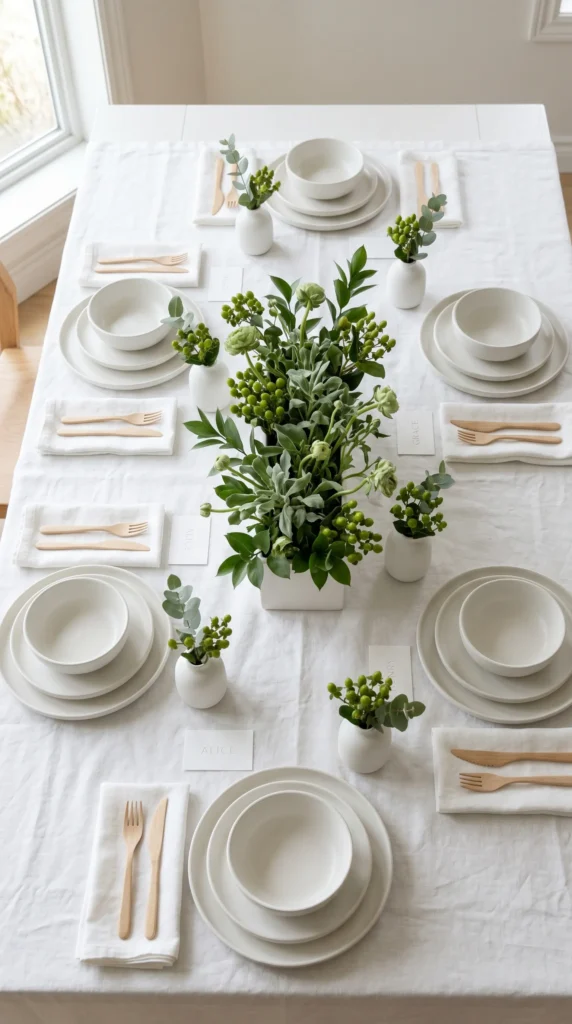
Vibe: Clean, meditative, modern.
Why It Works: White-on-white tablescapes work because they allow a single element—green foliage—to become the entire design statement. The psychology behind this is powerful: simplicity reads as intentional sophistication. Every white element (napkins, plates, linens) creates a quiet foundation that makes one green stem feel like a bold gesture rather than a small detail. The design principle is called “restraint through reduction”—when you remove everything except the essential, the essential becomes luminous. The negative space (white emptiness) is as important as the flowers themselves. Pale wooden flatware adds warmth without breaking the cool, clean aesthetic.
How to Get It: Begin with a pure white linen tablecloth (avoid cream or ivory—the purity matters here). Layer white ceramic plates; even if they’re different pieces, unifying them in white makes them cohesive. For the greenery, visit a florist and ask for soft sage-green foliage stems—hypericum berries, ruscus, or eucalyptus. Place one single stem in a small white ceramic bud vase at each place setting. In the table center, arrange a loose gathering of these same stems in a long, low white ceramic rectangular vessel. The beauty is in the constraint: nothing competes, everything breathes.
💡 Quick Win: White paper place cards with a single embossed letter (the guest’s initial) cost two dollars to make and read as impossibly refined. Emboss with a gold pen or marker—no fancy tools needed.
Shop The Look
| White linen tablecloth, wrinkle-resistant organic cotton | White ceramic dinner plates, modern simple shape |
| Single-stem white ceramic bud vases, set of 4 | Fresh eucalyptus and hypericum stems, florist bunch |
| White linen napkins, soft organic cotton | Long white ceramic rectangular vessel, minimalist design |
| Pale wooden flatware set, natural finish | Embossed white place cards, cardstock |
| Pale grey linen chargers, subtle texture | Cream pillar candles, unscented, minimalist holders |
3. Blush Velvet Runner with Gold Accents
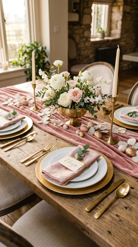
Vibe: Romantic, luxe, warmly layered.
Why It Works: Blush velvet introduces tactile luxury—it’s a fabric that invites touch, which makes diners feel welcomed and celebrated. Pairing it with brushed gold (not shiny brass) keeps the aesthetic warm without slipping into heavy or cold territory. Gold metallic accents ground the softness of blush, giving the table structural visual weight. The design principle here is “warm metallics elevate softness”—the two elements together feel more intentional than either alone. White flowers against blush and gold create tonal harmony; nothing clashes or demands attention away from the feeling of gathered comfort.
READ MORE: 18 Front Porch Swing Ideas You’ll Save Right Away
How to Get It: A blush velvet table runner (not full cloth) is easier to source and style—search for “blush pink velvet table runner” on Amazon or Etsy, and you’ll find options in various lengths. Layer it over a cream or white base tablecloth for definition. Gold chargers are the investment piece here; they transform even basic white plates into something statement-making. Select flowers that are pale pink or white (ranunculus, garden roses, or stock flowers work beautifully). Arrange them low in a compote dish or urn shape so guests can see across the table. Tie blush linen napkins with a single strand of gold metallic thread—this small detail signals luxury.
Shop The Look
| Blush pink velvet table runner, washable velvet | Brushed gold metal chargers, set of 4 |
| White ceramic dinner plates, modern minimalist | White ranunculus stems, fresh florist bunch |
| Brushed gold compote dish, pedestal vessel | Pale pink garden rose stems, fresh flowers |
| Cream tapered candles, 10-inch height | Brushed gold candlestick holders, pair |
| Blush linen napkins, organic cotton | Gold metallic thread spool, thin metallic |
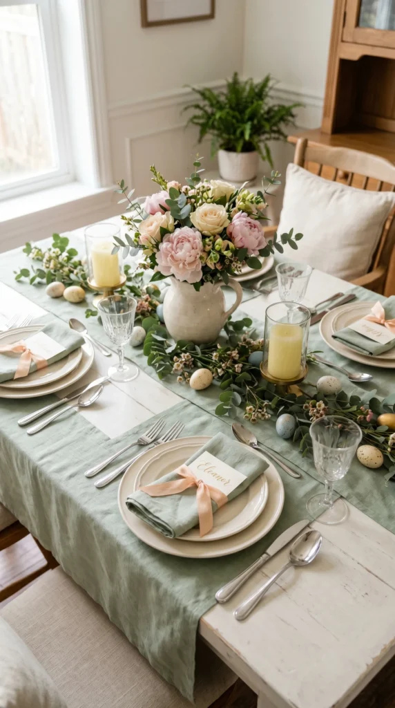
4. Botanical Garden Print Tablecloth Base
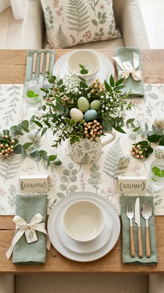
Vibe: Whimsical, garden-grounded, peaceful.
Why It Works: A botanical print tablecloth does the heavy lifting for you—it establishes the color palette and thematic direction instantly, allowing you to build around it rather than from scratch. The subtle line-art botanical print reads as sophisticated rather than cutesy because the lines are delicate and the colors (sage and blush) are muted. This design principle is “let the focal textile anchor the entire palette”—once the tablecloth is chosen, every other decision becomes easier and more cohesive. The print creates visual interest without requiring elaborate centerpiece arrangements; a simple gathered greenery bundle suffices because the table itself is already speaking.
How to Get It: Search for “botanical print cream tablecloth” or “garden print linen tablecloth” in sage and blush tones. Once you’ve selected the cloth, pull the two dominant colors from the print and use them as your napkin and accent colors (in this case, sage green and cream). Source a ceramic pitcher or vessel that echoes the botanical aesthetic—brands like Rifle Paper Co. or general home goods stores often carry these. Fill with mixed greenery: eucalyptus, ruscus, hypericum berries in pale pink, and filler flowers like baby’s breath. The arrangement should look gathered and casual, not formally arranged.
💡 Quick Win: Write guest names on cream cardstock in a simple botanical serif font (free fonts like “Botanical” exist online), then tuck each card into a stem of the centerpiece arrangement—no place card holders needed, and it looks garden-gallery elegant.
Shop The Look
| Botanical print cream linen tablecloth, sage-blush design | White ceramic dinner plates, simple round shape |
| Sage green linen napkins, organic cotton | Botanical-print ceramic pitcher, handthrown |
| Fresh eucalyptus and ruscus stems, florist bunch | Pale pink hypericum berry stems, fresh |
| Baby’s breath filler flowers, dried or fresh | Wooden flatware set, natural light finish |
| Cream silk ribbon, narrow width | Hand-lettered cream place cards, cardstock |
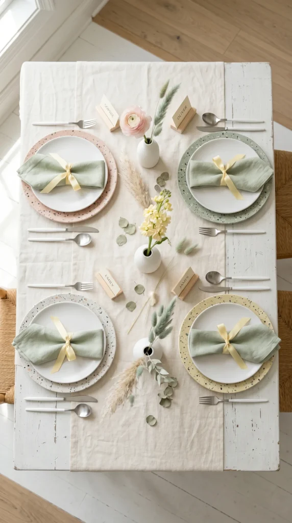
5. Pastel Rainbow Graduated Place Settings
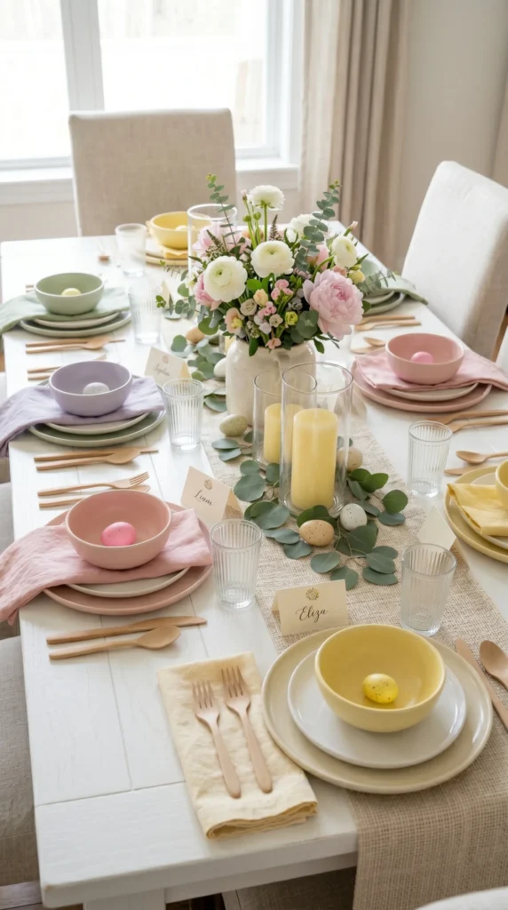
Vibe: Joyful, rhythmic, playfully colorful.
Why It Works: Graduating colors create visual rhythm—your eye travels along the table and feels the intentionality of the sequence. This approach is called “color pacing” in interior design; it’s the same principle that makes a well-composed painting feel dynamic rather than static. Because each color is in the pastel family, they don’t clash; instead, they harmonize. The repetition (yellow-pink-lavender-sage, then yellow-pink-lavender-sage again) creates a pattern that feels modern rather than chaotic. White flowers and cream chargers act as visual anchors that prevent the table from feeling too busy, and the rhythm itself becomes the design statement.
How to Get It: Source ceramic plates or bowls in four pastel tones—pale yellow, soft pink, pale lavender, and pale sage green. These don’t need to be matching sets; in fact, slightly varied shapes in the same tone read more elegantly. Repeat the color sequence around the table: if you seat eight guests, you’ll cycle through the four colors twice. Layer each pastel napkin under a white charger to add definition. Keep the centerpiece neutral (white flowers, cream vessel) so the table’s color story isn’t competing for attention. Pale wooden flatware unifies the palette without adding metal weight.
Shop The Look
| Pastel ceramic dinner plates, mixed set four colors | White ceramic chargers, simple round shape |
| Linen napkins in pastel set, four-color bundle | White ranunculus and peony stems, fresh florist bunch |
| Cream ceramic vessel, low and wide shape | Pale wooden flatware set, natural finish |
| Pale yellow pillar candles, glass hurricanes set of 4 | Cream place cards, cardstock |
| Eucalyptus garland, pale green stems | White linen tablecloth, wrinkle-resistant |
6. Tall Candle Arrangement with Trailing Ivy
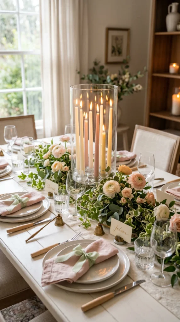
Vibe: Luminous, romantic, garden-lush.
Why It Works: Height variation in a centerpiece prevents the table from feeling flat. By using candles at graduated heights (achieved through flower frogs that allow you to position stems at different levels), you create visual movement—the eye travels up and down rather than resting on a single plane. Trailing ivy adds softness and movement that anchors the arrangement to the table surface; it feels gathered and organic rather than formally composed. The combination of candlelight (warm) with trailing greenery (cool) creates temperature contrast that feels balanced. Design principle: “Movement and light make a space feel alive.”
How to Get It: Begin with a tall clear glass cylinder vase—any clear, straight-sided vessel works. Place flower frogs of varying heights inside (these create platforms for stems). Insert tapered candles in cream, blush, and pale yellow into the frogs at different heights—aim for five to seven candles creating a triangular or pyramidal silhouette. Wrap trailing ivy or eucalyptus sprays around the base of the vase, securing gently with floral wire if needed. Tuck small ranunculus blooms into the ivy at intervals. Fill the vase with water to keep greenery fresh. Light the candles just before guests arrive; the glow will warm the entire table.
💡 Quick Win: Buy a bundle of trailing ivy from a grocery store florist and skip the floral frogs entirely—simply gather the vase with candles and weave ivy loosely around the exterior. It’s faster, looks just as lush, and costs five dollars.
Shop The Look
| Tall clear glass cylinder vase, simple straight shape | Cream tapered candles, 8-inch height, set of 10 |
| Blush pink tapered candles, 8-inch, set of 6 | Pale yellow tapered candles, 8-inch, set of 6 |
| Fresh trailing ivy stems, florist bunch | Fresh eucalyptus and ruscus stems, mixed bundle |
| Pale pink ranunculus stems, fresh flowers | Cream linen tablecloth, organic cotton |
| Blush linen napkins, organic cotton | Brass candle snuffers, pair |
7. Terrazzo Plate Styling with Pastels
Vibe: Serene, modern, subtly colorful.
Why It Works: Terrazzo chargers bridge two aesthetic worlds—they’re modern and sculptural, yet contain soft pastel flecks that nod to spring. Because the colors within the terrazzo are muted and diffused (not bold), the table reads as refined rather than playful. This design principle is “let pattern suggest color rather than declare it”—the terrazzo’s speckled pastels whisper the palette instead of shouting it. Pairing terrazzo with solid white and pale wood keeps the visual weight balanced; the charger becomes a focal point without the table feeling busy. Each place setting becomes a small composition because the charger is visually anchoring and beautiful.
How to Get It: Terrazzo chargers in pastel tones are increasingly available from home goods stores and online retailers—search for “terrazzo ceramic chargers pastel.” Layer each white dinner plate on top. Select pale linen napkins (sage green or pale blush) and tie each with a narrow silk ribbon in a complementary pastel tone. The flowers should be understated: three white bud vases down the center of the table, each holding a single stem (one ranunculus, one stock flower, one pampas). Pale wooden place card holders and flatware echo the natural aesthetic without adding visual weight.
Shop The Look
| Terrazzo ceramic chargers pastel, set of 4 | White ceramic dinner plates, simple round |
| Pale green linen napkins, organic cotton | Pale yellow silk ribbon, narrow spool |
| White ceramic bud vases, set of 3 | Pale pink ranunculus stems, fresh |
| Pale yellow stock flower stems, fresh | Dried sage pampas grass stems, bundle |
| Pale wood flatware set, modern minimalist | Pale wood place card holders, set of 4 |
8. Woven Placemat with Layered Textures
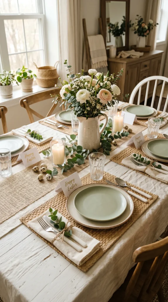
Vibe: Grounded, textured, warmly organic.
Why It Works: Texture is the unsung design principle—it’s what makes a monochromatic palette feel sophisticated rather than flat. When a table is rendered in creams, pale sage, and naturals, layering different textures (woven placemat, ceramic glaze, linen weave, twine) creates visual interest that color alone cannot. The design principle is “texture substitutes for color saturation”—you’re creating richness through material variation rather than chromatic variety. Wooden flatware, ceramic plates, woven rattan, linen, and natural twine speak to the same earthy language, so everything feels intentionally coordinated rather than randomly assembled.
How to Get It: Start with woven rattan or seagrass placemats in a natural pale tan—these ground each place setting tactilely and visually. Layer two ceramic plates (cream and pale sage) to introduce subtle height variation without disrupting sight lines. Tie each cream linen napkin with natural twine, then tuck a single sprig of fresh eucalyptus under the twine knot—this small detail feels gathered and effortless. Use a woven jute or natural linen table runner down the center to echo the placemat texture. Keep the centerpiece low and simple: white and blush flowers in a cream pitcher with scattered eucalyptus stems around it.
💡 Quick Win: Buy a roll of natural twine from a hardware or craft store (costs three dollars) and use it to tie every napkin and accent element—place cards, napkins, even small greenery bundles. The repetition of a single material creates visual cohesion instantly.
Shop The Look
| Woven rattan placemats, natural pale tan, set of 4 | Cream ceramic dinner plates, simple shape |
| Pale sage ceramic salad plates, subtle glaze | Cream linen napkins, organic cotton |
| Natural jute table runner, woven texture | White and blush ranunculus stems, fresh |
| Cream ceramic pitcher, rustic handthrown shape | Fresh eucalyptus stems, florist bundle |
| Cream pillar candles, glass hurricane holders, pair | Natural twine spool, jute or cotton |
9. Egg-Inspired Pastel Ceramic Vessels
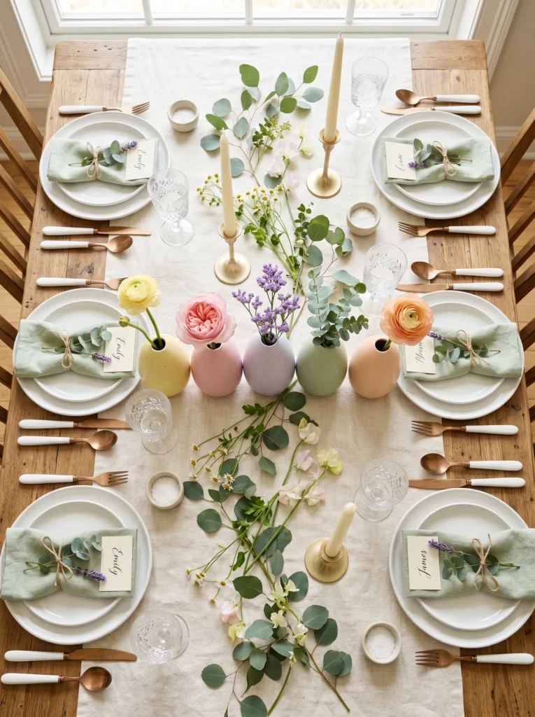
Vibe: Playful, spring-celebrating, whimsical.
Why It Works: Egg shapes are architecturally appealing—they’re organic, symmetrical, and immediately evoke spring and Easter without being literally decorated with eggs. Graduating pastel colors within the same tonal family (all light, all soft) create visual rhythm that feels intentional rather than rainbow-chaotic. The design principle is “shape plus color variation equals dynamic composition.” Because each egg vessel holds a single stem that matches its color, the table reads as thoughtfully composed rather than randomly decorated. The eye travels down the line of eggs and registers intentionality at every point.
How to Get It: Search for “pastel egg-shaped ceramic vessels” or “egg vases in pastel colors.” These have become increasingly available from home decor retailers and Etsy sellers specializing in Easter styling. Select five eggs in graduating or complementary pastel tones. Fill each with water and a single stem of fresh flower or greenery that echoes the vessel’s color. Arrange the eggs in a line down the table center, allowing space for sight lines between place settings. The simplicity of one stem per vessel is key—more would overpower the elegant concept. Scatter eucalyptus stems loosely around the egg vessels to create a garden effect.
Shop The Look
| Pastel egg-shaped ceramic vessels, set of 5 | Pale yellow ranunculus stems, fresh |
| Soft pink garden rose stems, fresh | Pale lavender statice or limonium stems, fresh |
| Soft sage eucalyptus stems, fresh florist bunch | Pale peach spray rose stems, fresh |
| White ceramic dinner plates, simple shape | Pale green linen napkins, organic cotton |
| Cream place cards, cardstock | Pale gold candlesticks, pair |
10. Citrine Yellow Linen with White Florals
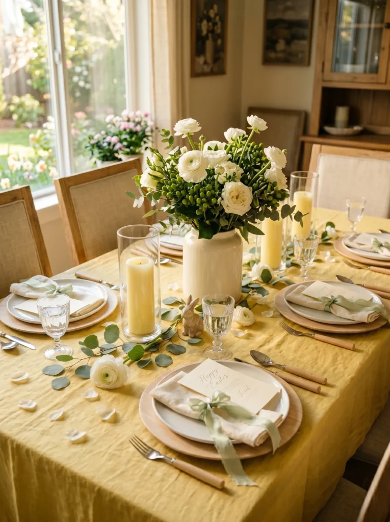
Vibe: Luminous, sophisticated, sun-warmed.
Why It Works: A single bold color choice (citrine yellow) paired with white creates instant visual impact and confidence. The yellow is warm without being childish because it’s muted—citrine rather than bright banana yellow—and pairing it exclusively with white (no competing accent colors) makes the statement feel refined. The design principle is “one bold color plus one neutral creates sophisticated impact.” Yellow naturally evokes spring and daylight, so it reads seasonally relevant without feeling themed. White flowers against yellow create maximum contrast in the best way—they pop without any harshness because yellow is inherently warm and inviting.
How to Get It: Source a quality linen tablecloth in soft citrine yellow—this is the investment piece that anchors the entire table. Pair it with pale wood chargers or simple white ceramic ones to keep the focus on the color story. White ceramic plates and cream napkins create visual breathing room, and pale green ribbons echo natural freshness. The flowers should be strictly white and green (ranunculus, garden roses, hypericum berries) arranged in a cream ceramic vessel that doesn’t compete with the tablecloth’s warmth. Scatter a few fresh white ranunculus petals across the cloth surface just before guests arrive—this feels intentional and garden-fresh without being overdone.
Shop The Look
| Citrine-yellow linen tablecloth, organic cotton-linen blend | Pale wood chargers, natural finish, set of 4 |
| White ceramic dinner plates, simple modern shape | Cream ceramic tall vessel, pedestal shape |
| White ranunculus stems, fresh florist bunch | White garden rose stems, fresh flowers |
| Green hypericum berry stems, fresh | Cream linen napkins, organic cotton |
| Pale green silk ribbon, narrow spool | Pale yellow pillar candles, glass holders, set of 4 |
11. Striped Linen Napkins with Minimalist Plating
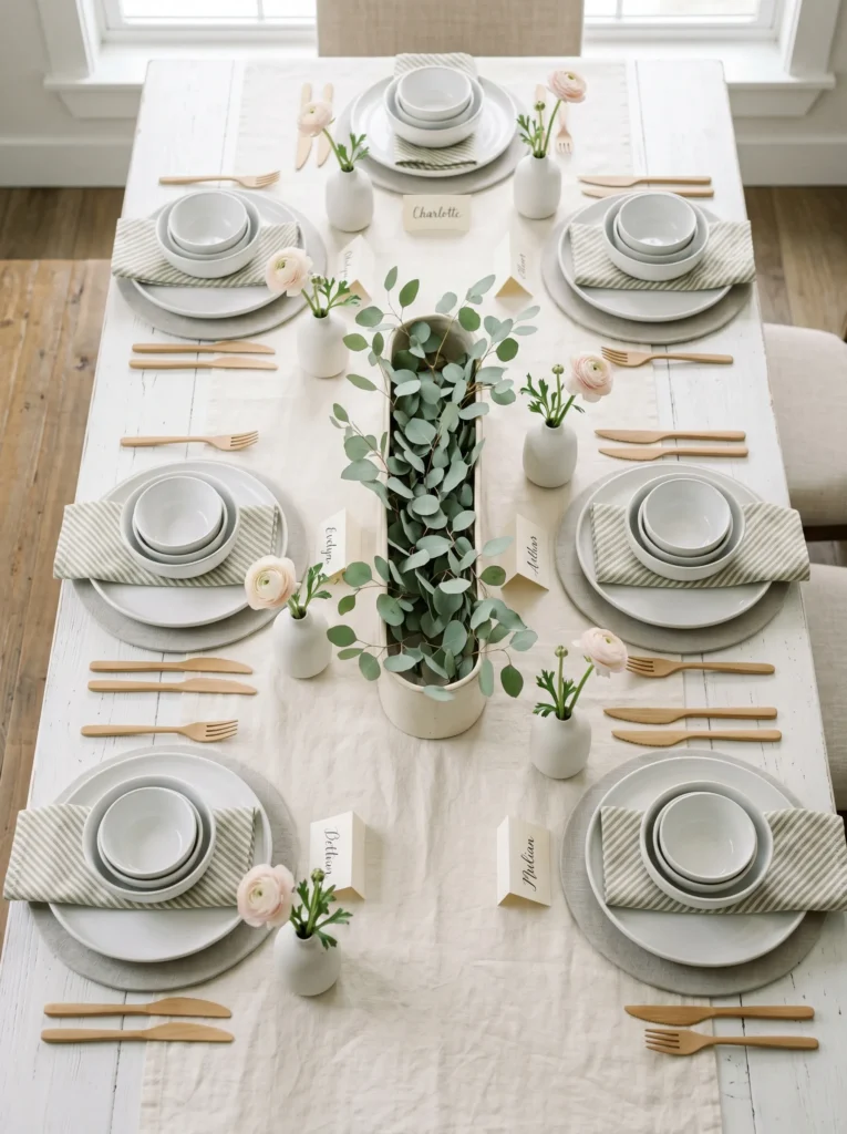
Vibe: Serene, refined, understated.
Why It Works: Striped napkins introduce gentle visual rhythm without feeling casual—the stripes are directional, which creates movement in an otherwise calm composition. Minimalist stacking of ceramic pieces (chargers, multiple plates, bowls) creates height variation and visual interest on the table surface itself, so the table doesn’t feel flat even without elaborate centerpieces. The design principle is “let geometry and layering substitute for abundance”—you’re creating a sense of intentionality through arrangement rather than decoration. A single stem at each place setting (rather than a gathered centerpiece) feels modern and respectful of negative space.
How to Get It: Select cream linen napkins with sage-green stripes—the stripes should be subtle, not bold. Fold each into a simple triangle and place it off-center on each plate, angling the point toward the viewer. Pale grey linen chargers add depth without brightness, and white ceramic pieces remain the visual anchor. Stack plates and bowls at each setting in a slightly offset way—not perfectly centered but clearly intentional. Place a single pale pink ranunculus stem in a small white ceramic bud vase at each place setting; this provides a personal floral moment without visual clutter. A long, low cream vessel filled with loose eucalyptus down the table center ties the color story together.
💡 Quick Win: Instead of traditional place cards, hand-letter guest names directly on cream cardstock in a modern serif font and prop each card against the water glass—minimal, elegant, and takes less time than fussing with card holders.
Shop The Look
| Cream and sage striped linen napkins, set of 4 | Pale grey linen chargers, subtle weave |
| White ceramic dinner plates, modern simple | White ceramic stacking bowls, nested set |
| Pale pink ranunculus stems, fresh flowers | White ceramic bud vases, set of 4 |
| Cream ceramic long vessel, low rectangle | Pale eucalyptus stems, fresh florist bunch |
| Pale wooden flatware set, modern minimalist | Cream place cards, hand-lettered |
12. Woven Seagrass Centerpiece with Candles
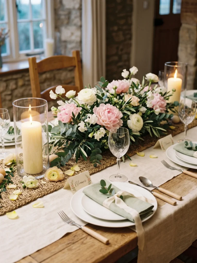
Vibe: Romantic, garden-grounded, intimate.
Why It Works: A woven seagrass base elevates the centerpiece architecturally—it grounds the flowers in texture and natural material rather than floating them in a standalone vase. The linear arrangement (flowers in a line rather than a rounded form) creates perspective down the table, drawing the eye naturally and making even narrow tables feel longer. Candlelight at both ends of the arrangement creates symmetry and balance, and warm light reflected on woven texture feels inviting. The design principle is “texture plus light plus linear arrangement equals intimate guide for the eye.” Peonies and ranunculus in pale tones remain soft while the seagrass provides visual structure.
How to Get It: Begin with a woven seagrass placemat or a flat woven seagrass base. Place two tall cream pillar candles in glass hurricanes at each end to anchor the arrangement. Create a linear arrangement of fresh flowers down the center of the seagrass base—pale pink peonies, white ranunculus, sage eucalyptus. Use florist foam placed within low vessels (like tea light holders) to anchor stems within the seagrass if needed, or simply tuck stems directly into the woven texture if it’s loose enough. Scatter pale yellow ranunculus petals around the base just before guests arrive. Light the candles as guests are seated.
Shop The Look
| Woven seagrass placemat or base, natural tan | Cream pillar candles, 8-inch, pair |
| Glass hurricane candle holders, pair | Pale pink peony stems, fresh florist bunch |
| White ranunculus stems, fresh flowers | Sage eucalyptus stems, fresh bundle |
| Pale yellow ranunculus petals, loose stem | White ceramic dinner plates, simple round |
| Pale sage linen napkins, organic cotton | Cream silk ribbon, narrow spool |
13. Copper Accents with Blush Florals
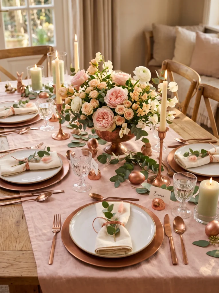
Vibe: Warm, luxe, romantic.
Why It Works: Copper is warmer than gold or silver, and when paired with blush pink, it creates a romantic, approachable luxury feel. Brushed copper (not shiny or polished) reads as sophisticated rather than harsh. The design principle is “warm metallics with warm florals create cohesion”—copper and blush exist in the same temperature family, so they feel naturally related rather than forced. Cream and white elements prevent the table from feeling overwhelming; they provide visual breaks that let the copper and pink breathe. Copper’s reflective quality catches light beautifully, especially in candlelit settings, making the table feel alive and dynamic.
How to Get It: Start with a blush pink linen tablecloth (cream works if blush feels too bold). Layer brushed copper chargers under white ceramic plates—these are the hero pieces. Select flowers in warm pastels: blush pink garden roses, pale peach spray roses, white ranunculus. Arrange them in a copper compote dish (these are increasingly available in home goods stores) or any copper-toned vessel. Copper candlesticks with cream tapered candles flank the arrangement. Tie cream linen napkins with thin copper wire or narrow copper-colored ribbon. If sourcing copper flatware feels impossible, pale wood flatware works beautifully and costs less.
💡 Quick Win: Instead of copper place card holders, simply write guest names on cream cardstock with a copper metallic pen and prop the card against the water glass—the copper pen ties into the palette and feels intentional without the extra investment.
Shop The Look
| Blush pink linen tablecloth, organic cotton | Brushed copper chargers, set of 4 |
| White ceramic dinner plates, modern simple | Brushed copper compote dish, pedestal vessel |
| Blush pink garden rose stems, fresh | Pale peach spray rose stems, fresh |
| White ranunculus stems, fresh flowers | Copper candlestick holders, pair |
| Cream tapered candles, 8-inch, pair | Cream linen napkins, organic cotton |
14. Monochromatic White with Eucalyptus Depth
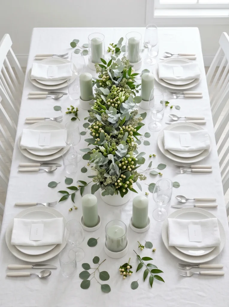
Vibe: Pure, meditative, luminously serene.
Why It Works: Pure monochromatic styling reads as intentional sophistication—there’s nowhere to hide, so every element must be refined and purposeful. The introduction of greenery in varying tones (not flowers, but foliage) creates visual depth and complexity within a restrained palette. The design principle is “monochromatic plus texture variation equals serene sophistication.” When you remove color entirely, texture, shape, and light become the design language—pale eucalyptus leaves catch light differently than ruscus stems, and hypericum berries add roundness that contrasts with linear stems. The table feels calm and meditative, not sterile, because natural materials speak warmth.
How to Get It: Begin with white linen or high-quality white cotton for the tablecloth. Layer white chargers and white ceramic plates with minimal pattern. Select pale greenery in various green-grey tones: eucalyptus in its natural grey-green shade, ruscus with deeper matte tones, and hypericum berries for texture contrast. Arrange loosely in a white ceramic vessel—the arrangement should feel gathered and natural, not formally designed. Scatter individual eucalyptus leaves across the tablecloth surface as a subtle design detail. Pale green (not white) candles add a whisper of color that prevents pure white from feeling cold.
Shop The Look
| White linen tablecloth, organic cotton, wrinkle-resistant | White ceramic chargers, simple round, set of 4 |
| White ceramic dinner plates, modern minimal | White ceramic vessel, low and wide |
| Pale eucalyptus stems, fresh florist bunch | Ruscus stems, fresh pale-green foliage |
| Hypericum berry stems, grey-green tones, fresh | Pale green pillar candles, white hurricane holders, pair |
| White place cards, minimal embossed detail | White linen napkins, organic cotton |
15. Graduated Glass Votives
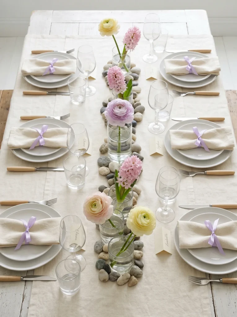
Vibe: Serene, spring-fresh, thoughtfully composed.
Why It Works: Graduated heights create visual interest and movement without requiring elaborate arrangements—the glass votives themselves become sculptural elements. A repeating color pattern (yellow-pink-lavender-pink-yellow) creates rhythm that feels mathematical and intentional rather than random. The river stones ground the arrangement in texture and create a Zen garden aesthetic, which reinforces the serene mood. The design principle is “repeating elements plus height variation plus natural materials equals meditative composition.” Single stems mean you’re celebrating the individual flower’s beauty, not obscuring it. Clear glass allows water and stones to become part of the visual story.
How to Get It: Source clear glass votives or small bud vases in varying heights—aim for five pieces with at least three different heights. Arrange them in a height pattern: short-medium-tall-medium-short creates a pyramid shape. Fill each partially with water. Insert a single stem of spring bulb flower that echoes the votive pattern (pale yellow-soft pink-pale lavender, repeating). Place river stones or pale grey pebbles around the base of each votive to ground the arrangement. This arrangement doesn’t require floral foam and can be assembled in minutes. The effect is simultaneously minimal and intentional.
💡 Quick Win: Buy a bag of river stones from a garden center (five dollars) and scatter them around the votive bases—this single textural element transforms simple glass containers into a spa-like Zen garden composition.
Shop The Look
| Clear glass votive holders, varying heights, set of 5 | Pale yellow ranunculus stems, fresh flowers |
| Soft pink hyacinth stems, fresh spring bulbs | Pale lavender ranunculus or limonium stems, fresh |
| River stones or pale grey pebbles, small bag | Cream linen tablecloth, organic cotton |
| White ceramic dinner plates, simple shape | Pale cream linen napkins, organic cotton |
| Soft lavender ribbon, narrow spool | Pale wooden flatware set, modern minimalist |
How to Start Your Easter Tablescape Transformation
The One First Move: Begin with a single hero piece—either a tablecloth in your chosen color (soft sage, blush, citrine yellow, or white) or a centerpiece vessel that speaks to you (a cream ceramic pitcher, a copper compote, a tall clear cylinder, or a woven seagrass base). This one piece anchors every other decision. If you choose the tablecloth first, all subsequent colors, napkins, and accents build from that foundation. If you choose the vessel first, the tablecloth, linens, and candles follow its cue. Anchoring to one piece prevents decision paralysis and ensures cohesion.
The Most Common Mistake: Overdecorating the table with too many florals, candles, place card details, and scattered elements. Easter tablescapes often fail when they feel fussy rather than fresh. The mistake is thinking abundance equals elegance—it doesn’t. A table crammed with flowers, multiple candlestick styles, competing napkin patterns, and decorative clutter reads as chaotic, not celebratory. The fix: choose one focal point (flowers or candles, not both as separate statements), limit your color palette to three to four tones, keep napkins simple, and let negative space breathe. Restraint is the hallmark of sophisticated tablescaping.
Budget Entry Points: Three specific items under fifty dollars that create immediate impact: (1) A single quality linen tablecloth in your chosen color—soft sage, blush, or cream—costs fifteen to thirty dollars and transforms the entire table instantly. (2) A ceramic vessel (pitcher, compote, or cylinder) in a neutral tone costs ten to twenty dollars and becomes your centerpiece anchor. (3) Fresh flowers sourced from a grocery store florist—a bundle of eucalyptus, a bunch of ranunculus, or a single stem of garden roses—costs five to ten dollars and feels far more expensive than the price. These three items (tablecloth, vessel, flowers) create a complete Easter tablescape for under fifty dollars total.
Realistic Expectations: A full Easter tablescape transformation—tablecloth, complete place settings, centerpiece, all accents styled—takes two to three hours if you’re shopping for pieces and one hour if you’re working with items you already own. A starter version (tablecloth, simple place settings, basic centerpiece) can be accomplished in a weekend and costs fifty to one hundred dollars. A fully realized, magazine-quality tablescape with multiple coordinated pieces, premium linens, fresh flowers, and detailed styling runs one hundred and fifty to three hundred dollars depending on the number of guests and the complexity of choices. Transformations don’t happen overnight; they’re incremental, and the joy is in the gathering process—discovering a linen color you love, finding the perfect vessel, selecting flowers that speak to the season.
Frequently Asked Questions About Easter Tablescapes
What is the difference between an Easter tablescape and a regular spring table setting?
An Easter tablescape intentionally celebrates the specific symbolism and renewal of the Easter season—it incorporates florals, soft pastels, and sensory elements that honor spring and gathering. A regular spring table might use bright greens and bold colors; an Easter tablescape stays in the pastels (soft sage, blush, pale yellow, lavender) and emphasizes the emotional tone of renewal and lightness. Easter tablescapes also often include symbolic elements like egg-shaped vessels, fresh spring bulb flowers like hyacinth or ranunculus, and soft candlelight that creates ceremony around the meal. The intentionality is what separates them.
What’s the best color palette for an Easter tablescape if I want to keep it modern?
Modern Easter tablescapes lean toward monochromatic or two-tone palettes in muted tones: white with pale sage green, cream with soft blush, or citrine yellow with white. Avoid rainbow pastels or overly “Easter-y” bright colors—these read as themed rather than sophisticated. Brushed metallics like copper or brushed gold add modernity better than shiny brass. The key is restraint: choose three colors maximum, ensure they’re all muted or pastel-toned (never bright), and repeat them consistently across linens, flowers, and accents. A white linen tablecloth with pale green napkins, white flowers, and subtle eucalyptus creates a modern Easter tablescape that feels elevated, not seasonal.
How much should I budget for fresh flowers in an Easter tablescape?
Fresh flowers for a tablescape serving four to six guests cost fifteen to thirty dollars when sourced from a grocery store florist, where bundles of ranunculus, eucalyptus, peonies, or garden roses are affordable and abundant in spring. A premium florist (where you’re buying individual stems and custom arrangements) will charge thirty to seventy-five dollars. The key to stretching budget dollars: ask the florist for a single mixed bundle of spring stems rather than individual high-end flowers, or select greenery-heavy arrangements (eucalyptus, ruscus, hypericum berries) that cost less than roses or peonies but create visual impact. Grocery store florals are genuinely beautiful for tablescaping; you don’t need premium florist pricing for a home table.
Can I create an Easter tablescape with artificial flowers, or do fresh flowers matter?
Fresh flowers genuinely matter for Easter tablescapes because the season itself is about renewal, growth, and the sensory experience of spring—freshness is part of the story. Artificial flowers read as seasonal decorations rather than celebrations of the actual season. That said, if fresh flowers aren’t available or budget doesn’t allow, dried botanicals (pampas grass, dried eucalyptus, dried ranunculus) read as thoughtful and intentional in a way that artificial silks don’t. If you must use artificial, select botanically accurate pieces in muted tones and ensure they’re dusted and pristine—obviously plastic or silk flowers undermine the elegant aesthetic. Fresh is always the better choice.
What’s the easiest Easter tablescape for a beginner to execute in less than one hour?
The easiest tablescape combines a single colored linen tablecloth, white ceramic plates from your existing dishes, simple linen napkins, and one vessel with fresh greenery. Step-by-step: (1) Lay a cream or pale sage linen tablecloth. (2) Set out white dinner plates and simple folded napkins at each seat. (3) Fill a single cream ceramic pitcher or vase with a grocery store florist bunch of mixed eucalyptus and ranunculus. (4) Place the vessel in the table center. (5) Light a few candles. This is a complete, elegant tablescape accomplished in under an hour with zero specialized skills. The secret is letting a single quality piece (the linen, the flowers, the vessel) do the visual work rather than trying to style multiple detailed elements.
Ready to Create Your Dream Easter Tablescape?
These fifteen Easter tablescape ideas span soft pastels and bold citrine yellows, minimalist geometry and lush botanical abundance, copper warmth and pure white serenity—so you can find an aesthetic that speaks to your space and sensibility. Transformation doesn’t happen all at once; it begins with a single choice: one linen color, one vessel shape, one flower bundle. Starting small isn’t a limitation; it’s the precise place where intention begins.
Today, make one specific choice toward your Easter tablescape vision. Maybe it’s ordering a soft linen tablecloth in the color that’s been calling to you, or visiting a florist to see what spring flowers feel fresh in person, or even photographing a tablescape idea from this article to pin as your north star. This small action is the beginning.
Imagine seated at your table once it’s complete—the candlelight catching on folded linens, fresh florals releasing their scent, the texture of a well-set place speaking care and welcome. That feeling is what an Easter tablescape is really about: creating space where gathering matters, where the table itself becomes an expression of thoughtfulness. Your guests will feel it the moment they sit down.
Pin your favorite Easter tablescape ideas to your spring entertaining board—save the monochromatic white arrangements if serenity calls to you, bookmark the blush and copper if warmth resonates, tag the botanical prints if garden-forward aesthetics are your language. Your ideal Easter table is waiting.