17 Front Door Colors to Instantly Boost Curb Appeal
A front door color is the single most powerful design statement your home’s exterior makes—it’s the handshake before anyone steps inside. This article gives you seventeen front door colors, from classic red to unexpected aubergine, that will transform how your home is seen from the street.
Imagine the feeling of pulling into your driveway and seeing a front door that makes you smile—a pop of personality that says “this is who we are.” A freshly painted door in the right hue can make your entire home feel more expensive, more welcoming, and infinitely more intentional. The texture of high-gloss paint catching the afternoon light, the satisfying weight of brass hardware in your hand, the way a deep forest green anchors a brick facade—these are the details that separate a house from a home.
Here are seventeen front door colors worth saving—and stealing.
Why Front Door Colors Work So Well
Front door colors work because they tap into a primal design truth: contrast creates focus. Historically, the front door has always been the symbolic threshold between public and private life, and its color signaled status, taste, and even political allegiance . In colonial America, a red door was a mark of hospitality and a literal welcome sign for travelers. Today, that same instinct remains—we read a door’s color as an invitation or a warning before we’ve even reached the porch.
The most effective front door colors draw from a palette of warm, nature-inspired tones and timeless statement shades . Think deep navy that reads almost black in the evening, a subdued sage green that echoes the landscaping, or a rich burnt umber that feels both grounded and sophisticated. These colors work because they’re not fighting the architecture—they’re completing it. Key materials include high-gloss exterior paint in satin or semi-gloss finishes for durability, paired with hardware in unlacquered brass, iron, or chrome that weathers beautifully over time .
Right now, front door colors are trending warmer and more personal . Designers are moving away from icy blues and cool grays toward earthy greens, terra-cotta oranges, and deep plums that feel rooted in nature rather than trend cycles . There’s also a cultural shift toward “quiet luxury” at the front door—colors that don’t shout but instead elevate through sophistication, like warm putty or charcoal gray.
Can small-space exteriors achieve this style? Absolutely—in fact, a bold front door color might be the single most effective way to add character to a home with limited yard space . For compact facades, prioritize high-contrast colors that create visual weight, and consider painting the door frame and sidelights the same hue to make the door feel larger and more intentional.
Style at a Glance
| Element | Core Trait | Core Trait |
|---|---|---|
| Philosophy | Contrast creates focus | Warmth invites connection |
| Materials | High-gloss exterior paint | Unlacquered brass hardware |
| Color Palette | Deep navy, sage green, burnt umber | Charcoal gray, warm putty, black |
1. Heritage Cherry Red
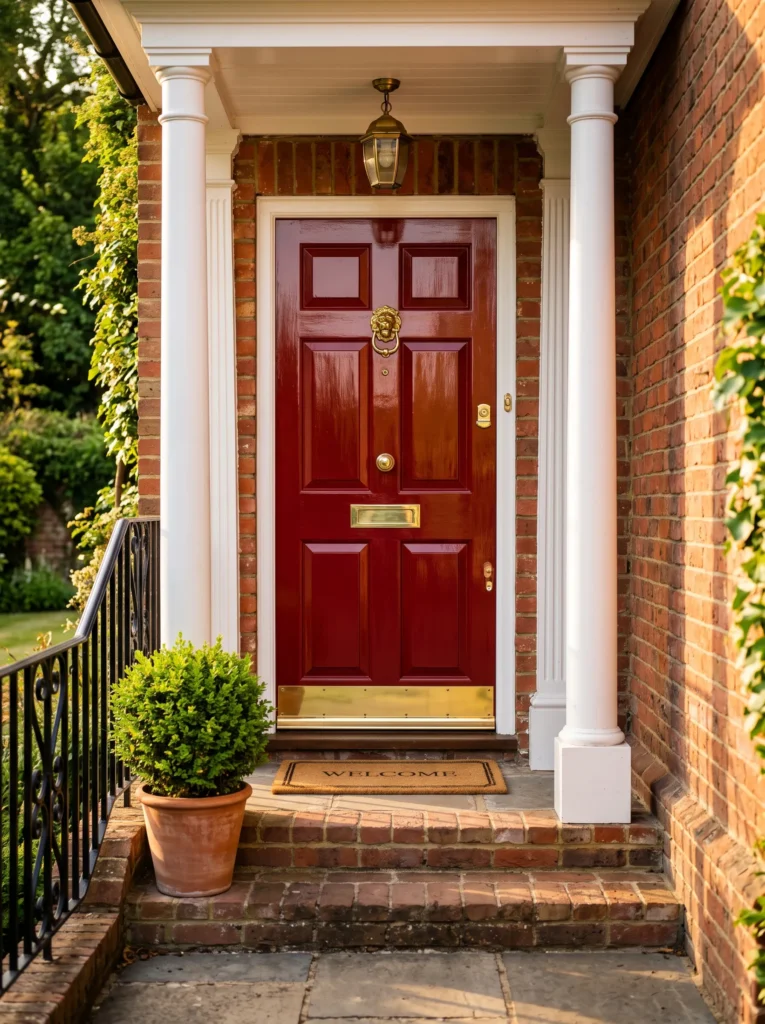
Vibe: Confident, welcoming, lucky.
Why it works: Red doors are timeless for a reason—they draw the eye instantly and have been symbols of welcome and good fortune across cultures for centuries. A rich cherry red creates a focal point that anchors the entire facade, especially against white or cream siding . This color works with both traditional and modern homes because it’s bold without being jarring.
How to get it: Choose a high-gloss finish in a warm, slightly muted red—think Benjamin Moore’s Heritage Red or similar. The gloss reflects light and makes the color feel deeper. Pair with polished brass hardware and a classic door knocker for maximum impact .
Shop The Look
☐ Ivory linen blackout curtain panel set grommet modern
☐ Taupe jute area rug 8×10 rustic modern
☐ Brown leather sofa living room modern
☐ Walnut wood coffee table with storage rustic
☐ Beige linen throw pillow covers set set modern
☐ Abstract canvas wall art set neutral tones
☐ Brushed brass floor lamp living room modern
☐ Dark walnut accent chair mid‑century modern
2. Deep Navy with Brass Accents
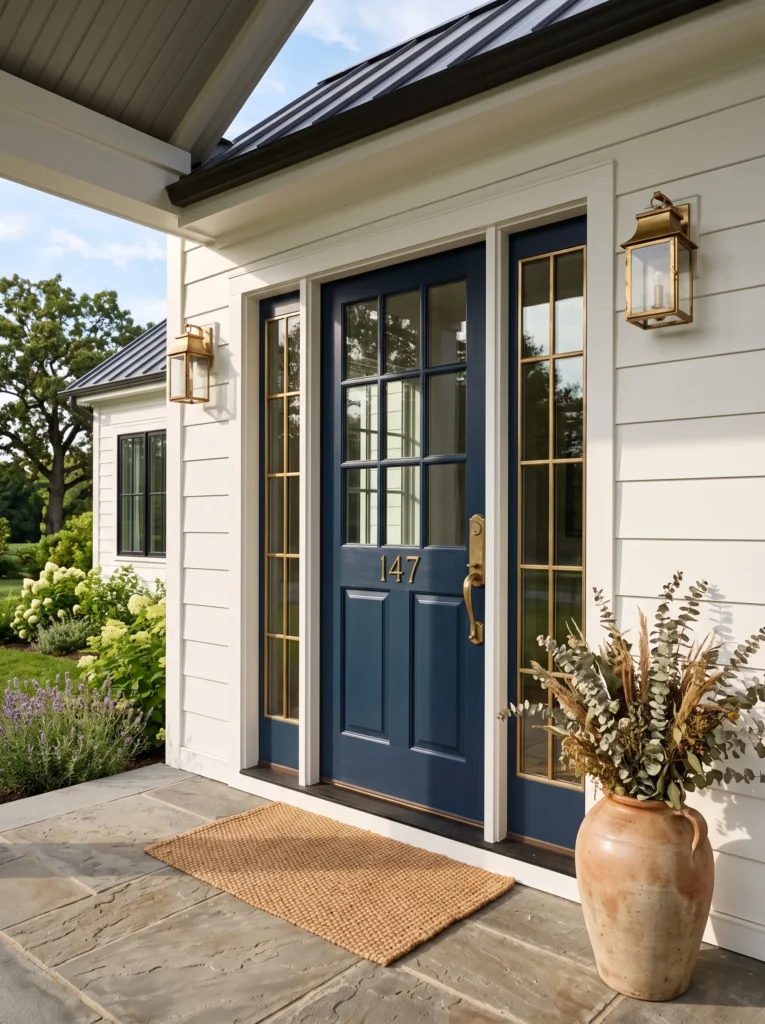
Vibe: Sophisticated, grounded, elegant.
Why it works: Navy front door colors are a designer favorite because they behave like a sophisticated neutral—they add depth without overwhelming the facade . The richness of a deep blue creates a subtle contrast against most siding colors, and when paired with warm brass hardware, it exudes a tailored, refined elegance that feels both classic and current.
How to get it: Select a true navy with enough saturation to read as blue, not black—Farrow & Ball’s Stiffkey Blue is an excellent option . Use a satin or semi-gloss finish for durability. The brass hardware is key here: choose unlacquered brass for a look that will develop a beautiful patina over time, or polished brass for immediate shine.
Shop The Look
☐ Ivory linen blackout curtain panel set grommet modern
☐ Taupe jute area rug 8×10 rustic modern
☐ Brown leather sofa living room modern
☐ Walnut wood coffee table with storage rustic
☐ Beige linen throw pillow covers set set modern
☐ Abstract canvas wall art set neutral tones
☐ Brushed brass floor lamp living room modern
☐ Dark walnut accent chair mid‑century modern
3. Sage Green Serenity
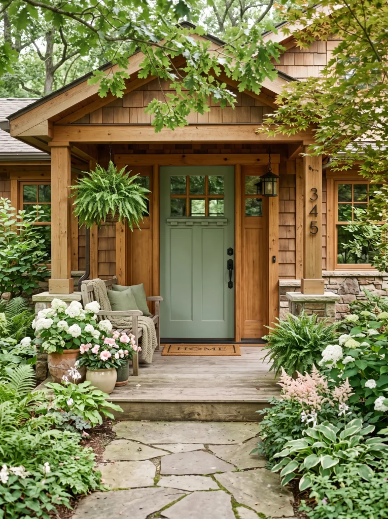
Vibe: Earthy, calm, rooted.
READ MORE: 15 Laundry Room Design Ideas You’ll Love This Year
Why it works: Sage green front door colors reflect the growing desire for nature-based design . This muted, gray-green hue blends seamlessly with landscaping and works beautifully with both modern and traditional architecture. Unlike a brighter green, sage feels understated and intentional—it connects the house to its natural surroundings without competing for attention.
How to get it: Look for a green with gray undertones to keep it sophisticated rather than cartoonish—Farrow & Ball’s Card Room Green or Benjamin Moore’s October Mist are strong choices. Pair with black or iron hardware for a cohesive look. This color performs best on homes with white, brick, or natural wood siding.
Shop The Look
☐ Ivory linen blackout curtain panel set grommet modern
☐ Taupe jute area rug 8×10 rustic modern
☐ Brown leather sofa living room modern
☐ Walnut wood coffee table with storage rustic
☐ Beige linen throw pillow covers set set modern
☐ Abstract canvas wall art set neutral tones
☐ Brushed brass floor lamp living room modern
☐ Dark walnut accent chair mid‑century modern
4. Matte Black Drama
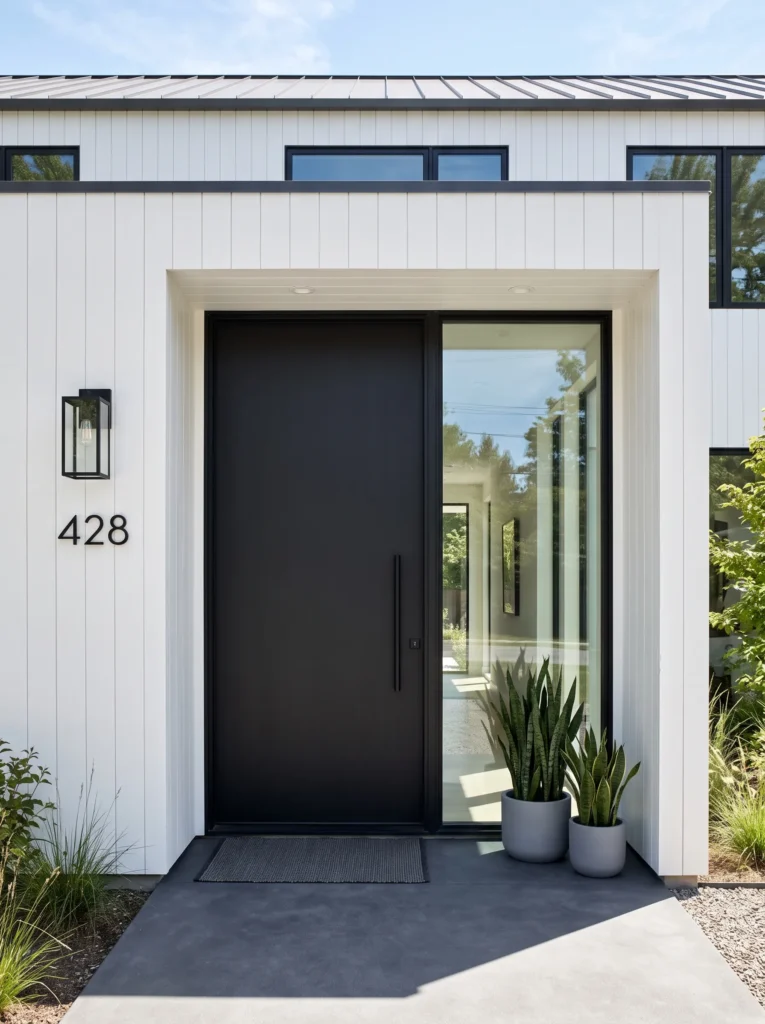
Vibe: Bold, modern, timeless.
Why it works: Matte black is having a major moment—and for good reason . A matte black door creates instant contrast against any lighter exterior, making the entrance feel both dramatic and polished. Designers love it because it’s versatile enough to work with virtually any architectural style, from modern farmhouses to Spanish Revivals.
How to get it: Choose a true matte or flat exterior paint for a velvety, non-reflective finish that feels expensive. Black works best when the rest of the exterior is lighter—white, cream, or light gray. For an even more sophisticated look, consider staining a wood door in a warm black finish that allows the wood grain to show through .
Shop The Look
☐ Ivory linen blackout curtain panel set grommet modern
☐ Taupe jute area rug 8×10 rustic modern
☐ Brown leather sofa living room modern
☐ Walnut wood coffee table with storage rustic
☐ Beige linen throw pillow covers set set modern
☐ Abstract canvas wall art set neutral tones
☐ Brushed brass floor lamp living room modern
☐ Dark walnut accent chair mid‑century modern
5. Burnt Umber Warmth
Vibe: Cozy, inviting, grounded.
Why it works: Burnt umber front door colors are trending as a more sophisticated alternative to bright red . This warm, earthy hue—encompassing burnt orange, terracotta, and deep rust—feels inherent to the architecture and rooted in a classic, welcoming entrance. It brings personality without being flashy, making it perfect for homeowners who want a warm invitation.
How to get it: Look for a shade that leans more brown than orange to keep it sophisticated. Clare Paint’s Fire Sign is one example of a terracotta that works well . This color pairs beautifully with stucco, brick, and natural wood tones. Use satin or semi-gloss finish for depth.
Shop The Look
☐ Ivory linen blackout curtain panel set grommet modern
☐ Taupe jute area rug 8×10 rustic modern
☐ Brown leather sofa living room modern
☐ Walnut wood coffee table with storage rustic
☐ Beige linen throw pillow covers set set modern
☐ Abstract canvas wall art set neutral tones
☐ Brushed brass floor lamp living room modern
☐ Dark walnut accent chair mid‑century modern
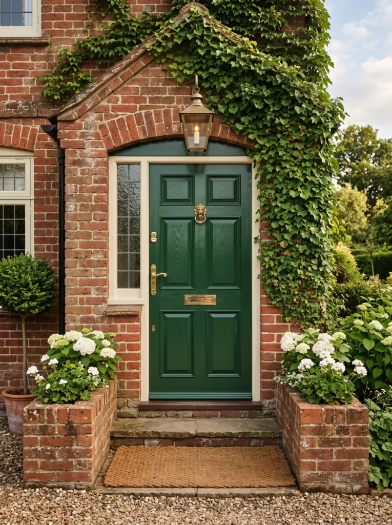
6. Forest Green Depth
Vibe: Rich, organic, stately.
Why it works: Forest green is rich, historic-feeling, and perfect for homes with older architecture and seasonal landscapes . This deep, hunter green pairs beautifully with warm brass details and works exceptionally well against brick exteriors—the warmth of the brick complements the cool depth of the green. It’s a color that feels both traditional and timely.
How to get it: Select a green with blue undertones for maximum depth—Farrow & Ball’s Beverly is a designer favorite . Avoid greens that lean too yellow, as they can read as muddy. This color performs best in high-gloss or satin finishes, and benefits greatly from brass or gold hardware.
Shop The LooK
☐ Ivory linen blackout curtain panel set grommet modern
☐ Taupe jute area rug 8×10 rustic modern
☐ Brown leather sofa living room modern
☐ Walnut wood coffee table with storage rustic
☐ Beige linen throw pillow covers set set modern
☐ Abstract canvas wall art set neutral tones
☐ Brushed brass floor lamp living room modern
☐ Dark walnut accent chair mid‑century modern
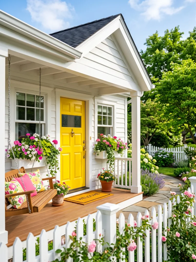
7. Sunny Yellow Joy
Vibe: Cheerful, bright, optimistic.
Why it works: Yellow is psychologically uplifting—it’s the color of sunshine, happiness, and welcome . A bright yellow door is impossible to ignore and makes everyone feel welcome before they’ve even knocked. In gray climates, yellow is a particularly powerful choice because it brings warmth to otherwise dreary days .
How to get it: Choose a yellow with warm undertones—think lemon or sunflower yellow rather than pale or greenish yellows. Farrow & Ball’s Citron is an excellent option . Keep the surrounding trim white or cream to prevent the color from feeling overwhelming. This color performs best on simple, uncomplicated facades.
Shop The Look
☐ Ivory linen blackout curtain panel set grommet modern
☐ Taupe jute area rug 8×10 rustic modern
☐ Brown leather sofa living room modern
☐ Walnut wood coffee table with storage rustic
☐ Beige linen throw pillow covers set set modern
☐ Abstract canvas wall art set neutral tones
☐ Brushed brass floor lamp living room modern
☐ Dark walnut accent chair mid‑century modern
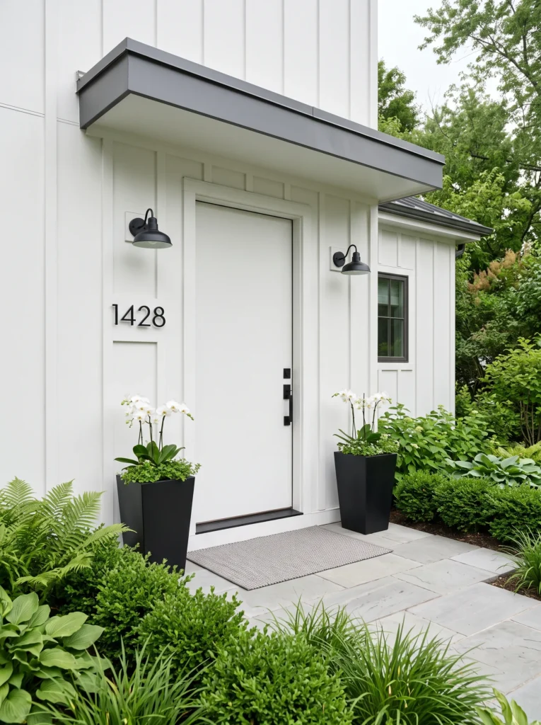
8. Crisp White Elegance
Vibe: Clean, serene, architectural.
Why it works: A crisp white door creates a serene, understated entrance that lets the architecture and landscaping take center stage . When the door is painted the same soft white as the house, it creates a monochromatic look that feels intentional and calming. This is a particularly effective choice for homes surrounded by lush greenery—the door becomes a canvas, and the plants are the paint.
How to get it: Use a matte or flat finish for a soft, sophisticated look that doesn’t compete with the surroundings. Choose a warm white, not a stark blue-white, to ensure the door feels inviting rather than clinical. This approach works best on homes with strong architectural details that can carry the visual weight.
Shop The Look
☐ Ivory linen blackout curtain panel set grommet modern
☐ Taupe jute area rug 8×10 rustic modern
☐ Brown leather sofa living room modern
☐ Walnut wood coffee table with storage rustic
☐ Beige linen throw pillow covers set set modern
☐ Abstract canvas wall art set neutral tones
☐ Brushed brass floor lamp living room modern
☐ Dark walnut accent chair mid‑century modern
9. Charcoal Gray Sophistication
Vibe: Modern, refined, versatile.
Why it works: Charcoal gray occupies that perfect sweet spot between bold and neutral . It’s sophisticated enough to make a statement but versatile enough to work with any home style. According to Zillow research, a charcoal gray door on a dark red brick home was associated with a potential offer premium of $3,753 . The cool, sophisticated gray creates elegant contrast without competing.
How to get it: Look for a charcoal with enough depth to read as distinct from black—Farrow & Ball’s Railings is a designer favorite . Pair with crisp white trim and black or brushed nickel hardware. This color works particularly well on brick and stone exteriors.
Shop The Look
☐ Ivory linen blackout curtain panel set grommet modern
☐ Taupe jute area rug 8×10 rustic modern
☐ Brown leather sofa living room modern
☐ Walnut wood coffee table with storage rustic
☐ Beige linen throw pillow covers set set modern
☐ Abstract canvas wall art set neutral tones
☐ Brushed brass floor lamp living room modern
☐ Dark walnut accent chair mid‑century modern
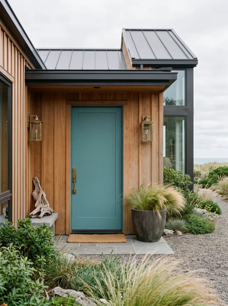
10. Teal Personality
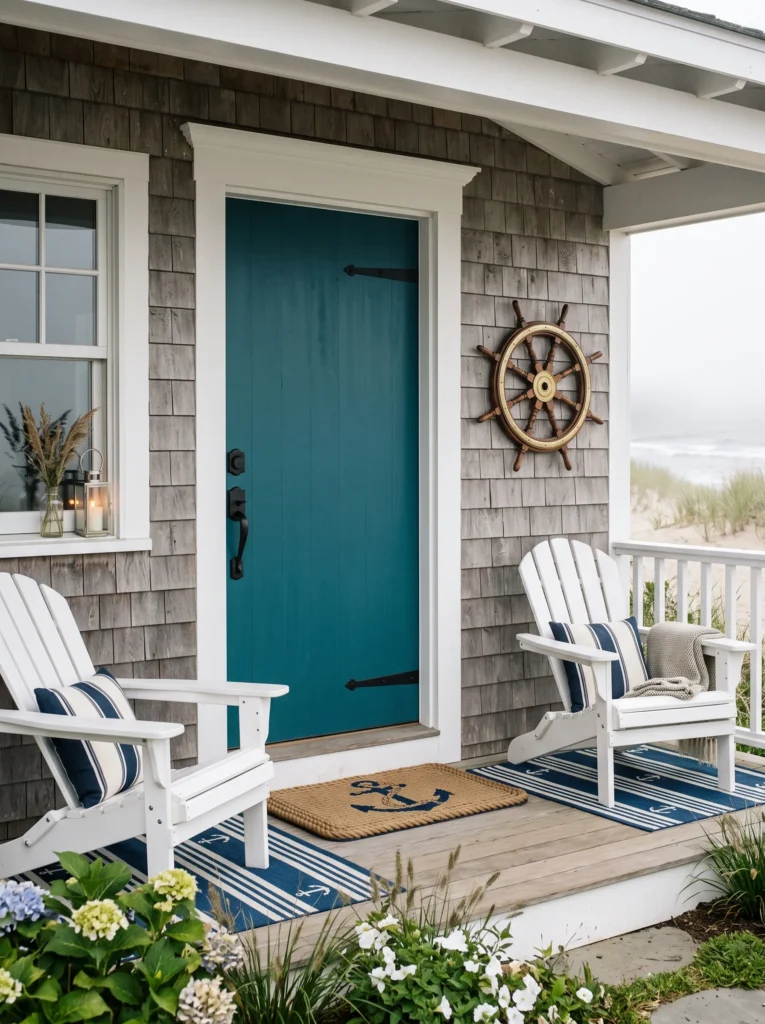
Vibe: Creative, bold, inviting.
Why it works: Teal combines the calming benefits of blue with the growth symbolism of green, creating a modern, inviting feel that shows creativity and balance . A moody teal front door adds unexpected personality without being overwhelming . This color is particularly effective for beach homes or cottages where a more playful entrance is appropriate.
How to get it: Choose a teal with enough gray in it to keep it sophisticated—think Benjamin Moore’s Van Deusen Blue or similar. This color performs best in satin or semi-gloss finishes. Pair with black or natural wood tones for a cohesive look.
Shop The Look
☐ Ivory linen blackout curtain panel set grommet modern
☐ Taupe jute area rug 8×10 rustic modern
☐ Brown leather sofa living room modern
☐ Walnut wood coffee table with storage rustic
☐ Beige linen throw pillow covers set set modern
☐ Abstract canvas wall art set neutral tones
☐ Brushed brass floor lamp living room modern
☐ Dark walnut accent chair mid‑century modern
11. Light Blue Freshness
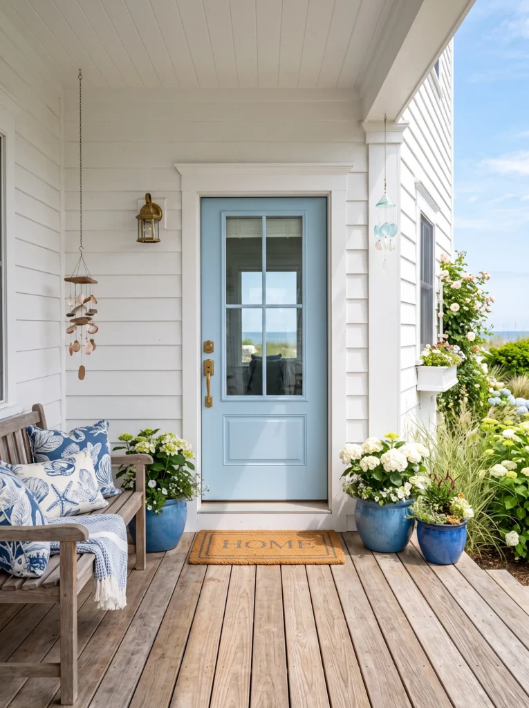
Vibe: Airy, coastal, welcoming.
Why it works: Light blue front door colors evoke a sense of tranquility and peace, making them a popular choice for coastal and beach homes . According to Zillow research, a light blue door on a solid white home was associated with a potential $5,023 offer premium . The soft, cheerful hue creates a friendly first impression.
How to get it: Choose a blue with enough saturation to read as intentional—powder blue or denim blue works beautifully . Pair with crisp white trim and natural wood accents. This color works best on simple, monochromatic exteriors where the door can do the heavy lifting.
Shop The Look
☐ Ivory linen blackout curtain panel set grommet modern
☐ Taupe jute area rug 8×10 rustic modern
☐ Brown leather sofa living room modern
☐ Walnut wood coffee table with storage rustic
☐ Beige linen throw pillow covers set set modern
☐ Abstract canvas wall art set neutral tones
☐ Brushed brass floor lamp living room modern
☐ Dark walnut accent chair mid‑century modern
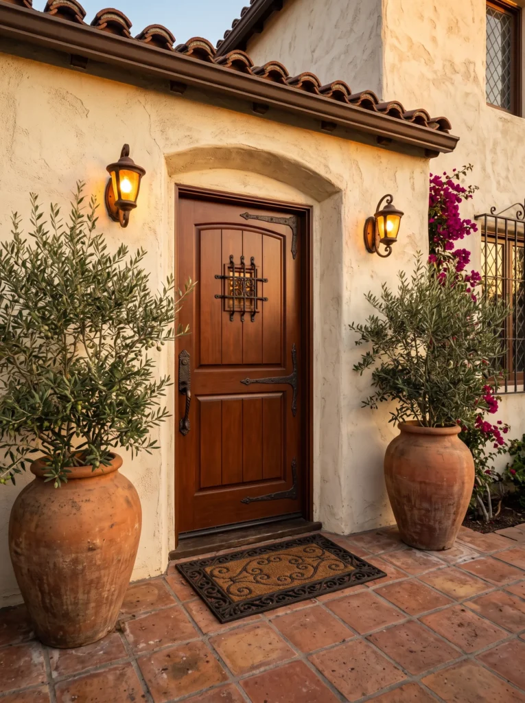
12. Warm Wood Stain
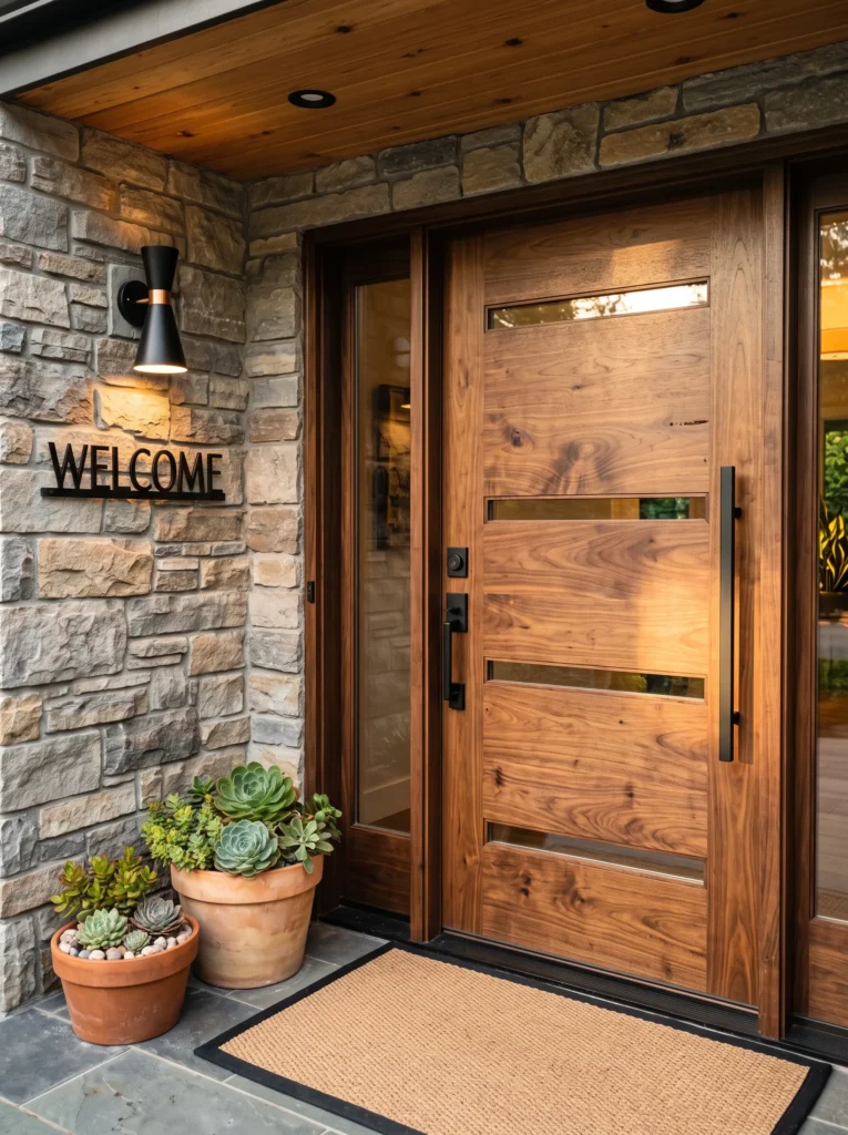
Vibe: Natural, warm, timeless.
Why it works: Warm wood stains are having a resurgence as homeowners embrace natural materials . A stained wood door brings richness and texture that paint simply cannot replicate—the grain adds depth and character to the front of the home. Unlike painted doors, stained wood ages beautifully and can be refreshed with a simple application of oil.
How to get it: Choose a warm, golden oak or walnut stain that highlights the wood’s natural grain . Look for a door with vertical or horizontal grain patterns for added visual interest. Pair with black or iron hardware for contrast, or brass for warmth.
Shop The Look
☐ Ivory linen blackout curtain panel set grommet modern
☐ Taupe jute area rug 8×10 rustic modern
☐ Brown leather sofa living room modern
☐ Walnut wood coffee table with storage rustic
☐ Beige linen throw pillow covers set set modern
☐ Abstract canvas wall art set neutral tones
☐ Brushed brass floor lamp living room modern
☐ Dark walnut accent chair mid‑century modern
13. Deep Aubergine
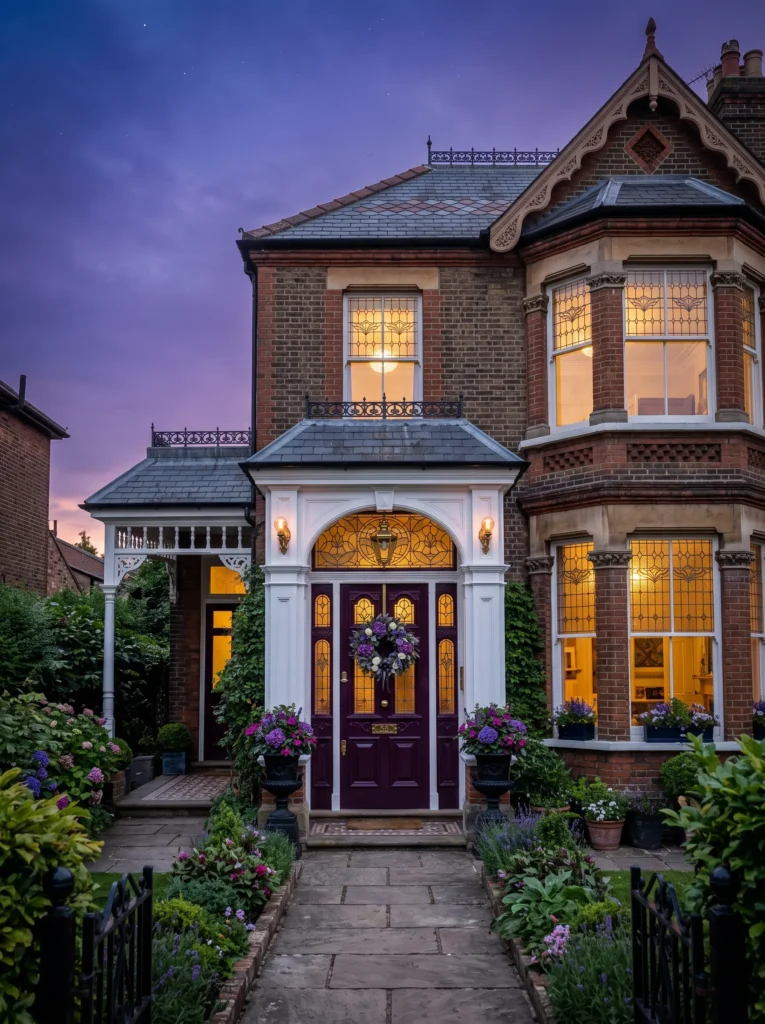
Vibe: Dramatic, royal, unexpected.
Why it works: Deep aubergine or plum front door colors offer a dramatic, elegant alternative to traditional reds . This rich, warm purple brings a sense of royalty and whimsy to the entrance without being cartoonish. It’s a color that’s both bold and refined, perfect for homeowners who want to make a unique statement.
How to get it: Choose a purple with enough brown in it to read as warm and grounded—think Benjamin Moore’s Plum Royale or PPG’s Purple Basil . Pair with gold or brass accents for a sophisticated finish. This color performs best on homes with neutral siding that won’t compete.
Shop The Look
☐ Ivory linen blackout curtain panel set grommet modern
☐ Taupe jute area rug 8×10 rustic modern
☐ Brown leather sofa living room modern
☐ Walnut wood coffee table with storage rustic
☐ Beige linen throw pillow covers set set modern
☐ Abstract canvas wall art set neutral tones
☐ Brushed brass floor lamp living room modern
☐ Dark walnut accent chair mid‑century modern
14. Cool-Toned Teal
Vibe: Sophisticated, coastal, refined.
Why it works: Cool-toned teal elevates a home’s exterior while embracing its coastal setting . This soft, blue-green hue feels both fresh and timeless—it’s not as loud as a bright turquoise but adds more personality than a standard blue. It’s a color that works particularly well on homes near the water.
How to get it: Look for a teal with gray undertones to keep it sophisticated rather than beachy-kitschy. Farrow & Ball’s Dix Blue is a designer favorite for this look . Pair with white or cream trim and black or brass hardware.
Shop The Look
☐ Ivory linen blackout curtain panel set grommet modern
☐ Taupe jute area rug 8×10 rustic modern
☐ Brown leather sofa living room modern
☐ Walnut wood coffee table with storage rustic
☐ Beige linen throw pillow covers set set modern
☐ Abstract canvas wall art set neutral tones
☐ Brushed brass floor lamp living room modern
☐ Dark walnut accent chair mid‑century modern
15. Warm Putty Neutral
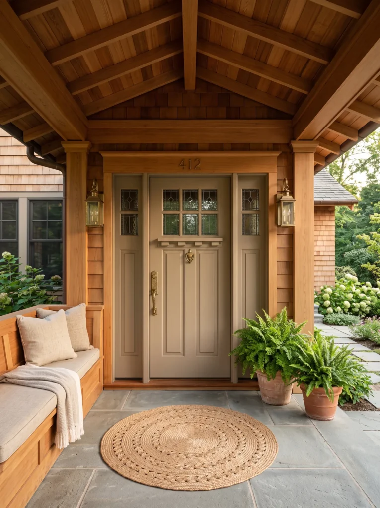
Vibe: Quiet, elegant, sophisticated.
Why it works: Warm putty is the quiet luxury neutral of front door colors—it doesn’t announce itself but elevates the house by letting the craftsmanship speak louder than the color . This sophisticated shade goes well with any type of hardware and works with virtually any architectural style. It’s the perfect choice for homeowners who want elegance without statement.
How to get it: Choose a greige or warm taupe with enough depth to read as intentional, not just beige. Farrow & Ball’s Dimity is an excellent example of this tone . Use a satin or semi-gloss finish to give the neutral color some light-reflecting depth.
Shop The Look
☐ Ivory linen blackout curtain panel set grommet modern
☐ Taupe jute area rug 8×10 rustic modern
☐ Brown leather sofa living room modern
☐ Walnut wood coffee table with storage rustic
☐ Beige linen throw pillow covers set set modern
☐ Abstract canvas wall art set neutral tones
☐ Brushed brass floor lamp living room modern
☐ Dark walnut accent chair mid‑century modern
16. Cinnamon Slate
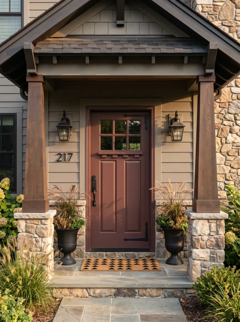
Vibe: Warm, distinctive, grounded.
Why it works: Cinnamon Slate—a unique combination of plum and brown—offers a warm, distinctive alternative to standard neutrals . This 2025 Color of the Year pick balances warmth and coolness, making it surprisingly versatile. It pairs beautifully with warm grays and soft greiges while adding a subtle pop of personality.
How to get it: Look for Benjamin Moore’s Cinnamon Slate or a similar plum-brown blend. Pair with warm gray siding and soft white trim. This color is particularly effective on Craftsman and traditional-style homes where the door is a focal point.
Shop The Look
☐ Ivory linen blackout curtain panel set grommet modern
☐ Taupe jute area rug 8×10 rustic modern
☐ Brown leather sofa living room modern
☐ Walnut wood coffee table with storage rustic
☐ Beige linen throw pillow covers set set modern
☐ Abstract canvas wall art set neutral tones
☐ Brushed brass floor lamp living room modern
☐ Dark walnut accent chair mid‑century modern
17. Playful Aqua
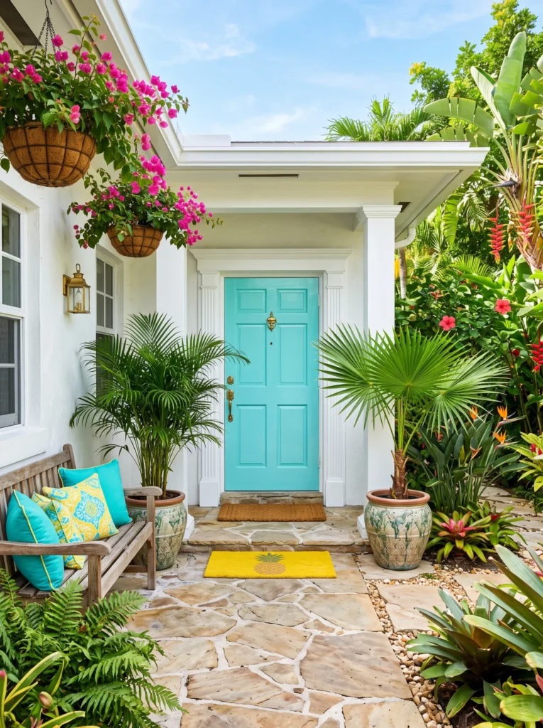
Vibe: Joyful, fresh, unexpected.
Why it works: Playful aqua is a more vibrant, personality-packed alternative to muted blues . This turquoise-blue hue brings tropical energy and southwestern vibes to any entrance . It’s a color that’s impossible to ignore and makes your home feel like a permanent vacation. Designers predict more clients will ask for these playful turquoise and teal tones in 2026.
How to get it: Choose a turquoise with enough green in it to keep it from reading as too blue—Benjamin Moore’s Santa Clara is an excellent option . Pair with natural wood or white trim to ground the bold color. Keep the landscaping simple with green plants to let the door steal the show.
Shop The Look
☐ Ivory linen blackout curtain panel set grommet modern
☐ Taupe jute area rug 8×10 rustic modern
☐ Brown leather sofa living room modern
☐ Walnut wood coffee table with storage rustic
☐ Beige linen throw pillow covers set set modern
☐ Abstract canvas wall art set neutral tones
☐ Brushed brass floor lamp living room modern
☐ Dark walnut accent chair mid‑century modern
How to Start Your Front Door Color Transformation
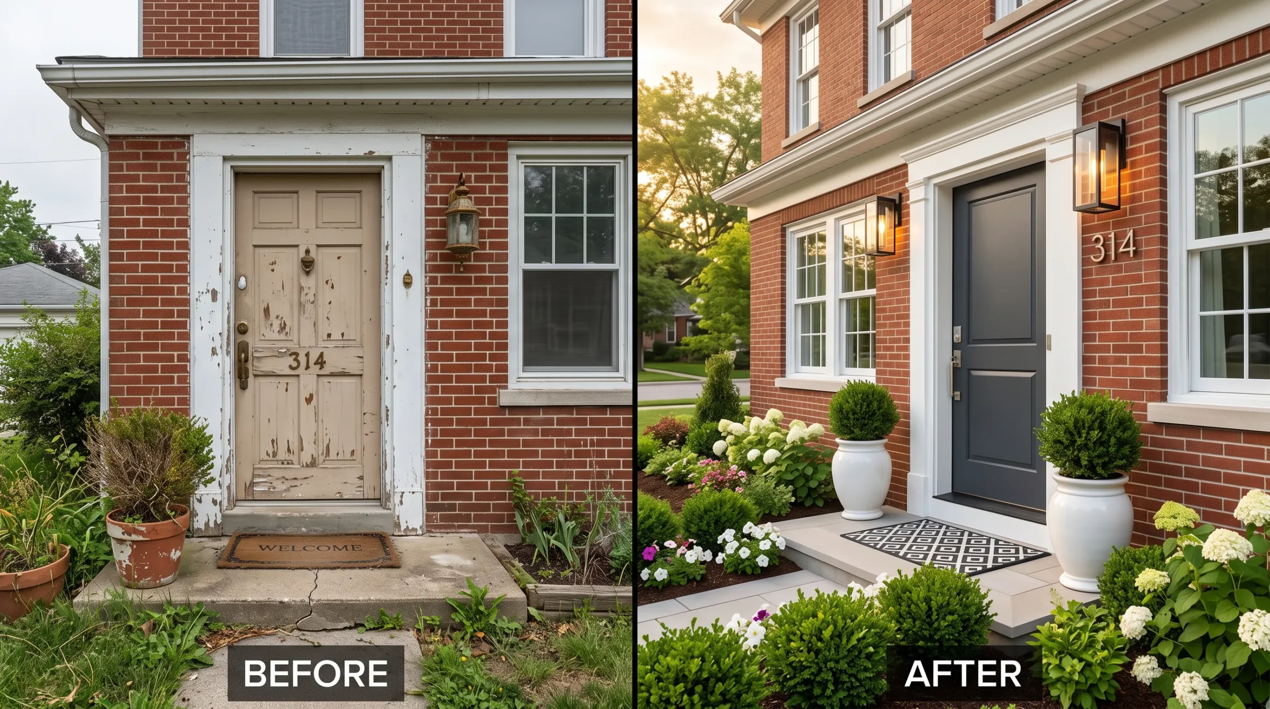
The one first move that anchors everything else: choose your paint color, then test it on your actual door. Not a swatch in the store, not a sample painted on paper—buy a sample quart and paint a large section of your door (at least two feet square) and live with it for a week. See it in morning light, harsh midday sun, and the golden hour. See it on a rainy day and a clear day. This is the only way to truly understand how front door colors behave on your specific facade and with your specific light exposure.
The most common mistake beginners make is choosing a color that fights the architecture or the landscaping. A cool blue on a warm red brick home will clash, not complement . Similarly, a white door on a white house simply disappears, which the data shows can hurt home value . The fix is simple: identify whether your home’s exterior is warm-toned (red brick, cream siding) or cool-toned (gray stone, blue-gray siding), then choose a door color from the same temperature family for a cohesive look.
For budget entry points under $50, you can achieve immediate impact with three specific items: a high-quality exterior paint sample quart ($20-$30) to test your color, a fresh satin or semi-gloss finish paint gallon ($40-$80) for the actual project, and a new black or brass house number set ($15-$30) that matches your hardware style. A gallon of paint is typically enough for the door and trim, and hiring a professional can cost anywhere from $100 to $200 .
A full front door color transformation can be completed in a single weekend—one day for cleaning, sanding, and priming if needed, and one day for applying two coats of paint. The full transformation of the entire entryway—including sidelights, trim, and landscaping updates—could take a few weeks of planning and sourcing. A realistic budget for a starter version (just the paint and hardware) is $100-$300, while a full door replacement and professional painting could range from $500 to several thousand dollars depending on the door material.
Frequently Asked Questions About Front Door Colors for Curb Appeal
What are the best front door colors to increase home value?
The best front door colors depend entirely on your home’s exterior, according to Zillow research . For simple, monochromatic exteriors, bold colors like light blue and yellow add value—a light blue door on a white home was associated with a potential $5,023 premium. For complex exteriors like brick or mixed materials, neutral doors like charcoal gray or white performed best, with charcoal gray on dark red brick associated with a potential $3,753 premium.
What front door colors should I avoid?
Avoid colors that clash with your home’s exterior or disappear into it. Red doors on brick homes can knock off as much as $6,738 from what buyers are willing to pay . White doors on white homes scored dead last on buyer interest and tour intentions . Designers also warn against white or neon shades, which can decrease resale value .
How much does it cost to paint a front door?
Painting a front door typically costs $20 to $80 for a gallon of paint (enough for the door and trim), while hiring a professional may cost $100 to $200 . For the best results, choose a satin, semi-gloss, or high-gloss finish that reflects light and is more durable than matte paint .
How do I choose a front door color that matches my house?
Start by identifying your home’s architectural style and the warmth or coolness of its exterior materials. For traditional homes like Colonial or Victorian, classic colors like black, red, and navy work beautifully . For brick homes, choose warm-toned colors like dark olive green or deep browns because cool colors will not complement traditional red brick . You can also look inside your home—open your front door and see what color your pillows or art are, and use that as a starting point for your exterior color .
What finishes and hardware work best with front door colors?
High-gloss or semi-gloss finishes make front door colors pop and are more durable for exterior use . For hardware, unlacquered brass is a designer favorite because it develops a beautiful patina over time and feels timeless . Black or iron hardware works well with bold colors, while brass or gold hardware elevates darker shades like navy, forest green, or deep aubergine .
Ready to Choose Your Front Door Color?
From heritage red to warm putty, from deep navy to playful aqua, these seventeen front door colors prove that the right hue can transform your home’s entire presence on the street. The variety here—from sophisticated neutrals to bold statements—means there’s a front door color for every architecture and every personality. Remember, transformation doesn’t require a new door or a major renovation; sometimes the most powerful change is the simplest one.
Your front door color journey starts with a single quart of sample paint and a weekend of honest testing. The front door is the first thing people see—and the last thing you see when you leave. Make it count.
Save your favorites to your Pinterest board, and when you find the front door color that makes you feel something real, you’ll know. Here’s to the front door colors that make coming home feel just a little bit better.